
Welcome to Volnyn
Sign in or create an account to continue
Continue with Google
or
Sign in with email
New here? Create an account
By continuing, you agree to our Terms of Service
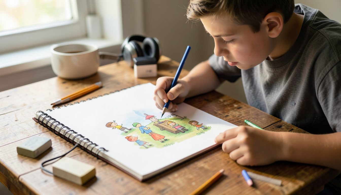
Many first games look messy for the same reason: the pieces come from everywhere. A detailed character from one pack, a cartoon background from another, sound effects at five different volumes. Small games look and feel best when every piece seems to belong together. You do not need to be a trained artist to get there. You need a simple style you can repeat, a limited set of colors, and a few sounds that tell players what is happening.
Choose a style based on what you can produce consistently, not on what looks most impressive in other people's games. Some styles that work well for small browser games:
Before drawing everything, make one test scene with the player, one enemy or obstacle, one collectible and one background. If those four look right together, the rest becomes much easier.
A small palette ties a game together. Start with a handful of colors: one or two for the background, one strong color for the player, one for hazards and one for rewards. Add a lighter and a darker version of each if you need shading.
Give each color a job and stick to it. If red means danger, do not use red for a friendly character. Players learn these signals quickly and rely on them without thinking. Also check that important things differ in shape or brightness, not only in color, so the game still reads clearly for players who see color differently.
Players should spot the player character, hazards and rewards instantly, even on a small phone screen. A simple order of importance helps:
A quick test: shrink a screenshot of your game to thumbnail size, or simply squint at the screen. If you can still find the player and the danger, the art is doing its job. If everything blends together, mute the background before you change anything else.
Sound tells players what happened without making them look. You only need a few effects to start: one for the main action, one for collecting something, one for getting hurt or failing, and one for winning or finishing a level. Keep them short, and make sure each one is easy to tell apart from the others.
Balance the volumes so that no effect is much louder than the rest, keep music quieter than the effects, and loop music smoothly so the join is not noticeable. Always include a mute button, and do not start loud audio before the player has interacted with the game.
Free art and sound packs are a great help, but free to download does not always mean free to use however you like. Before you use any asset, read its license:
Keep a simple list of every asset you use, where it came from and its license. Add a credits screen if any asset requires attribution. This takes a few minutes and saves you from replacing art after your game is already out in the world.