Welcome to Volnyn
Sign in or create an account to continue
Continue with Google
or
Sign in with email
New here? Create an account
By continuing, you agree to our Terms of Service
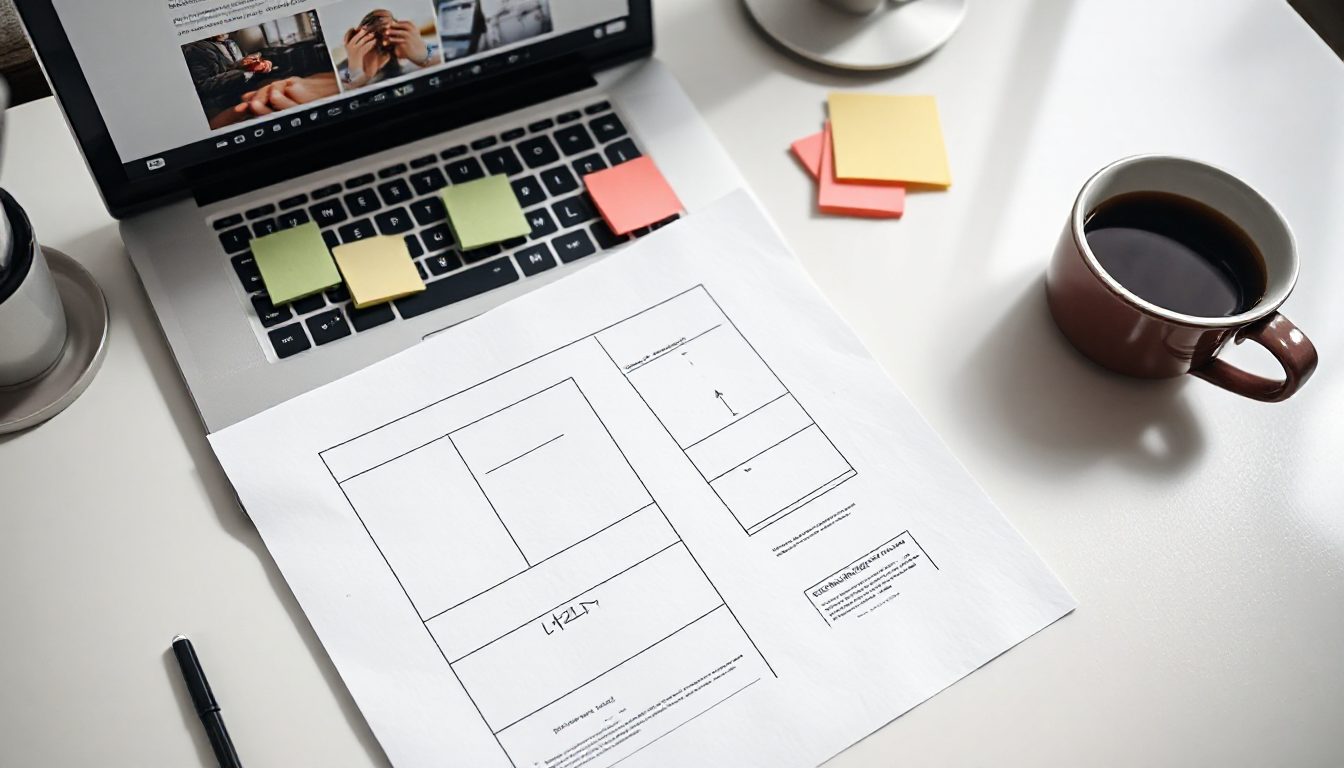
Your homepage talks to everyone. A landing page talks to one kind of visitor who arrived from one place — an ad, an email, a post — and asks them to do one thing. That focus is why landing pages convert two to five times better than sending traffic to the homepage.
Decide the single action before writing a word: book a call, buy the product, download the guide, join the waitlist. Remove the main navigation menu. Every link that is not the goal is an exit.
The headline matches what brought them there. If the ad said "Birthday cakes delivered in Lahore", the headline says it too. The subheadline adds the reason to choose you: "Photo of your cake before it leaves the kitchen."
Show the product or the result, not a stock photo of smiling people. The button says what happens: "Choose your cake", not "Submit".
Star rating, number of customers, logos of clients or press. Placed right under the hero, it answers "are they real?".
Two or three sentences that describe the visitor's situation better than they could. People trust whoever names their problem accurately.
Three steps with icons. "Choose a design → Pick a delivery slot → We send a photo before dispatch." It makes buying feel easy.
Three to six, each a heading and one line. Benefits, not features: "Never a surprise on the day" rather than "Photo verification system".
Three short testimonials with names and photos. Then the five questions that stop people buying — price, timing, guarantee, delivery area, how to pay.
Repeat the offer and the button. Add any deadline or guarantee.
| Fields | Typical effect |
|---|---|
| Email only | Highest sign-ups, lowest intent |
| Name, email, phone | Good balance for leads |
| 6+ fields | Fewer, more qualified leads |
Ask only what you need for the next step. You can ask the rest on the call.
Once the page gets steady traffic, test the headline first, then the hero image, then the button text. Run each test until each version has at least 100 conversions or two weeks, whichever comes later.
Short for cheap, simple, familiar offers. Long for expensive or unfamiliar ones, where visitors need more answers before deciding.
Describe your offer to Volnyn's AI builder and it lays out these sections for you, mobile-first, ready to edit. Start free at volnyn.com.