
Welcome to Volnyn
Sign in or create an account to continue
Continue with Google
or
Sign in with email
New here? Create an account
By continuing, you agree to our Terms of Service
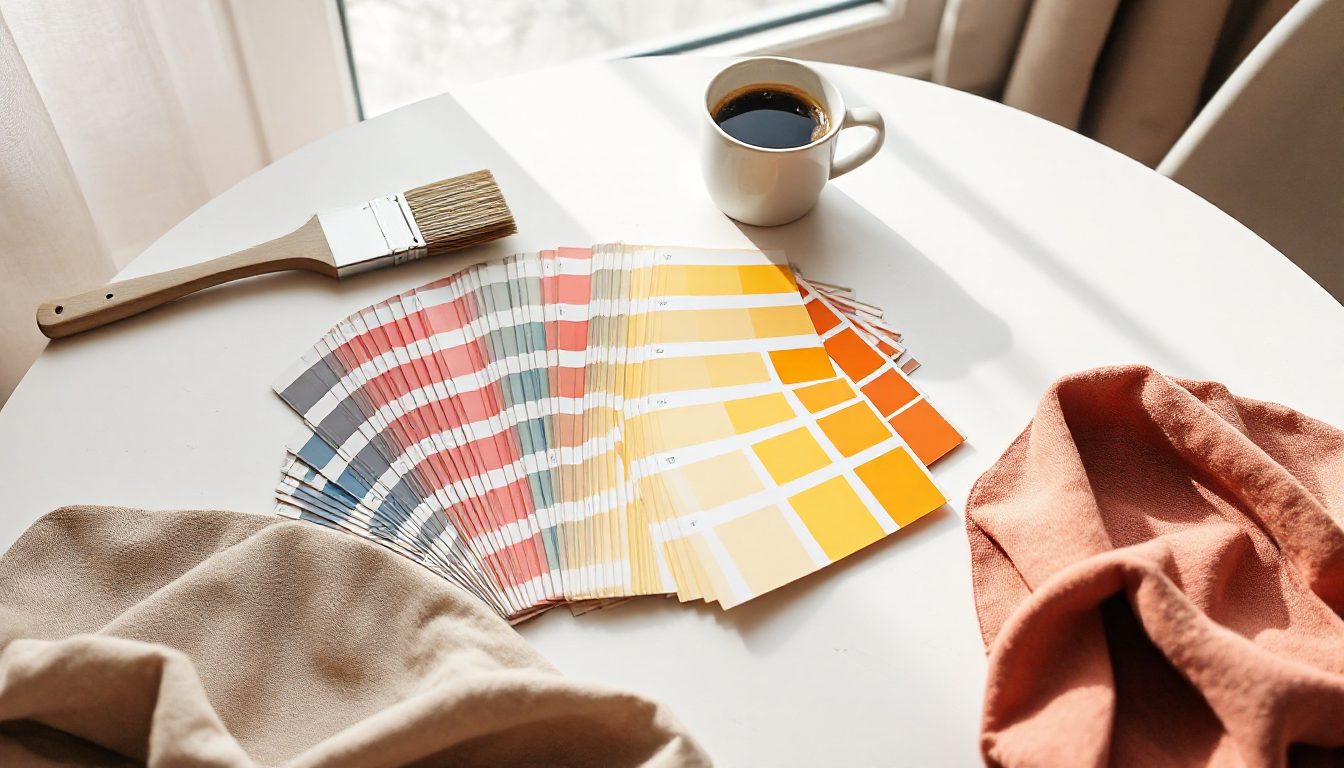
Colour is often the first thing people notice about a brand, before they read a single word. The right palette makes a business look coherent and memorable. The wrong one — or no palette at all — makes a site feel thrown together, however good the content is.
Before choosing colours, write down three words for how you want customers to feel: calm, energetic, premium, playful, trustworthy, natural. Colours should support those words.
| Colour | Common associations | Often used by |
|---|---|---|
| Blue | Trust, calm, reliability | Finance, healthcare, tech |
| Green | Nature, health, growth | Organic food, wellness, gardening |
| Red | Energy, urgency, appetite | Restaurants, sales, sport |
| Orange | Friendly, affordable, creative | Kids, entertainment, retail |
| Yellow | Optimism, warmth | Cafés, children, travel |
| Purple | Luxury, creativity | Beauty, premium products |
| Black | Elegance, power | Fashion, luxury, design studios |
| Earth tones | Warmth, craft, authenticity | Handmade goods, interiors, coffee |
These are tendencies, not rules — and meanings differ between cultures. Use them as a starting point.
The accent is the most important choice. If it's used only for actions, visitors quickly learn "that colour means click here".
Write down the exact hex codes and use them everywhere — website, social posts, invoices, packaging.
Text must be easy to read for everyone, including people with low vision or those reading on a phone in sunlight. Accessibility guidelines recommend a contrast ratio of at least 4.5:1 for normal text. Light grey text on white, or white text on pale yellow, fails. Free online contrast checkers tell you in seconds.
A palette that looks lovely as five squares can look very different on a full page. Apply it to your homepage and check:
Two or three main colours plus neutrals is plenty for most small businesses.
Yes, but do it as a planned refresh, updating everything at once.
On Volnyn you can set your brand colours once and every section of your site follows them — or let the AI builder suggest a palette that fits your business. Start free at volnyn.com.