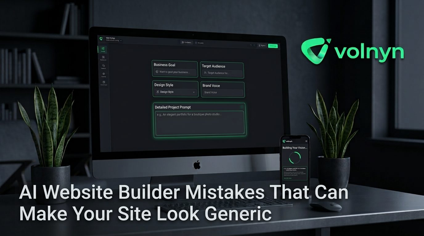
An AI website builder can give you a polished website in minutes, but a polished first draft is not necessarily a distinctive website. When the same prompts, templates, stock imagery, and generic copy are used across businesses, the result can feel interchangeable.The problem is rarely that AI cannot create attractive pages. The problem is that the builder has limited information about what makes your business different. The good news is that most of the fixes are straightforward.
1. Starting With a Vague Prompt
One of the easiest ways to get a generic website is to give the AI almost nothing to work with. A prompt such as “create a website for a marketing agency” describes an industry, not a business.
AI website builders work from the information you provide. Volnyn, for example, recommends being specific about the business and its goal when generating a site. A detailed brief gives the builder more useful direction than a broad category alone.
Instead of:
“Build a website for a restaurant.”
Try something closer to:
“Build a website for a family-run Italian restaurant specializing in handmade pasta, private dinners, and local catering. The main goal is to increase reservations and catering inquiries.”
The second prompt gives the AI information about the business, positioning, services, audience, and conversion goal. Those details can influence the structure and content of the starting site.
2. Treating the First AI Draft as the Final Design
AI-generated websites are starting points, not substitutes for editorial judgment. Publishing the first version without reviewing it is one of the fastest ways to end up with a site that looks like a template.
Review the generated website with a simple question: “Could another business in the same industry publish this exact page?” If the answer is yes, it needs more customization.
Look for opportunities to change the:
- Hero headline and supporting message
- Order and purpose of page sections
- Calls to action
- Images and illustrations
- Typography and visual hierarchy
- Spacing, colors, and section treatments
- Examples, testimonials, and proof points
Volnyn's AI Website Builder includes a visual editor for changing text, images, colors, and sections, making this refinement stage part of the normal website-building process. Explore Volnyn's AI Website Builder to see how the workflow is structured.
3. Leaving Generic AI Copy Unedited
Design is only half the problem. Generic wording can make a visually attractive website feel generic within seconds.
Watch for vague phrases such as “innovative solutions,” “tailored services,” or “committed to excellence” when they are not supported by specific information. These phrases could describe thousands of companies.
Replace them with details that only your business could credibly say. Explain what you sell, who you serve, how your process works, what customers can expect, and why someone should choose you.
For example, “We provide innovative digital solutions” says very little. “We redesign Shopify stores for independent fashion brands and focus on improving product discovery and checkout flow” gives visitors a much clearer reason to keep reading.
4. Using Stock Images That Say Nothing About Your Business
A generic image can undermine an otherwise customized website. A consulting company does not become more credible simply because its homepage contains a photograph of anonymous professionals shaking hands in an office.
Use images that communicate something real about the business whenever possible: your products, workspace, team, projects, location, customers, process, or finished work.
If original photography is not available, choose imagery based on a specific visual brief rather than searching for the broadest possible category. The goal is not merely to find a “nice photo.” It is to find an image that supports the message of that particular section.
5. Choosing a Template Without Adapting Its Structure
Templates are useful because they remove the blank-page problem. They become a problem when their structure dictates the entire website.
Volnyn currently offers more than 550 templates across business types and says its templates are customizable and mobile-responsive. That variety makes choosing a relevant starting point easier, but customization still matters. V Volnyn
Choose a starting template based on your business and objective, then question every section. Does your business need three service cards, or would a process section work better? Does the homepage need a large testimonial block near the top? Should the primary action be a booking request, purchase, consultation, or portfolio view?
A template should provide structure without becoming your brand.
6. Designing for Trends Instead of Brand Recognition
Following every current design trend can make a website look modern for a short time but forgettable over the long term. A distinctive site usually has a consistent visual system rather than a collection of fashionable effects.
Define a small set of recurring choices: primary and secondary colors, heading styles, button treatment, image direction, spacing rules, and the tone of illustrations or graphics. Then use those choices consistently across the site.
Good customization is not about adding more effects. It is about making deliberate decisions.
7. Ignoring Mobile Review
A website can look distinctive on a large monitor and still feel generic or awkward on a phone if the hierarchy collapses. Review the mobile version before publishing and check the elements that matter most to visitors.
- Is the main message visible quickly?
- Are buttons easy to tap?
- Are headings and paragraphs comfortable to read?
- Do images crop sensibly?
- Are important sections buried below unnecessary content?
Volnyn states that websites built with its platform are responsive across desktop, tablet, and mobile, while also recommending that users preview the mobile view before publishing. VVolnyn
8. Forgetting Accessibility While Customizing
Personalization should not come at the expense of usability. For example, a distinctive color palette still needs enough contrast for text to remain readable. The W3C's WCAG guidance specifies a minimum contrast ratio of 4.5:1 for normal text in common cases. Review the W3C contrast guidance when refining your colors.
Also check heading hierarchy, link clarity, image alternative text, keyboard usability, and whether important information remains understandable without relying only on color.
A Simple Pre-Publish Test
Before launching an AI-built website, run this five-minute originality check:
- Remove the logo mentally. Can you still tell what the business does?
- Read only the headlines. Do they communicate a specific offer?
- Look at the images. Do they represent this business or any business?
- Check the calls to action. Is there one clear next step for the visitor?
- Compare the site with three competitors. What visual or messaging choices make yours different?
If the answers are vague, the website needs another customization pass.
How to Make an AI-Built Website Feel Original
The strongest approach is to give AI a strong foundation and then apply human judgment. Start with a specific brief, select a relevant template, replace generic copy, use authentic visual material, refine the page structure, establish consistent brand choices, and test the experience on mobile.
That workflow is also consistent with Volnyn's own recommendations: describe the business specifically, state the website's goal, start from an appropriate template, use real content, and preview the result on mobile. VVolnyn
If you want to build from an AI-generated starting point rather than a blank canvas, Volnyn's AI Website Builder can generate the initial structure and give you a visual editor for customization. The important part is what happens after generation: your business knowledge, content, visuals, and design decisions are what turn a fast draft into a website that actually feels like yours.
Conclusion
The biggest AI website builder mistake is not using AI. It is assuming that speed eliminates the need for decisions.
A generic website usually comes from generic inputs, untouched first drafts, interchangeable imagery, vague copy, and template-driven design. Give the builder better information, challenge its first choices, and add details that competitors cannot copy. The result can be faster to build without looking mass-produced.
For additional guidance on getting started, Volnyn's guide to creating your first website covers the broader process from describing a website through customization and publishing.
>