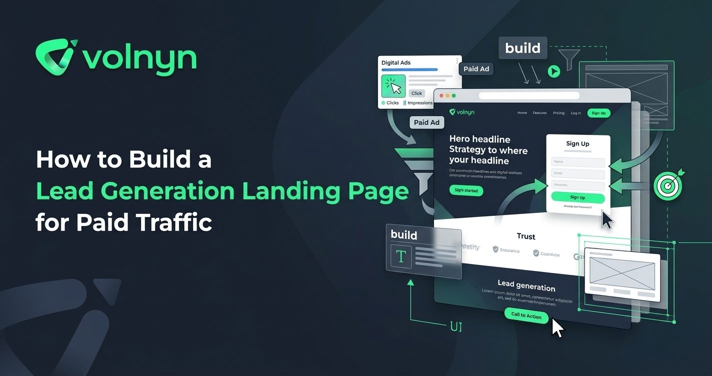
Paid traffic can bring people to a website quickly, but sending every visitor to a general homepage is not always the clearest path to a lead. A dedicated landing page gives a campaign one audience, one offer, and one primary action.
This guide explains how to build a lead generation landing page for paid traffic, from defining the offer and matching the ad message to creating the form, adding trust signals, and checking the complete conversion journey.
1. Start With One Campaign Goal
A lead generation landing page works best when its purpose is obvious. Before designing the page, decide exactly what you want visitors to do.
- Request a quote
- Book a consultation
- Request a product demo
- Submit an enquiry
- Join a waitlist
- Download a useful resource
Choose one primary conversion action. You can provide secondary navigation for visitors who need more information, but the main page should not force people to choose between several competing outcomes.
For example, a paid campaign promoting a free consultation should lead to a page built around that consultation, rather than a general homepage containing unrelated services and announcements.
2. Match the Landing Page to the Ad
Visitors arrive with an expectation created by the advertisement. The landing page should immediately confirm that they have reached the right place.
If an ad promises a free website consultation, the landing page headline should clearly mention the consultation rather than switching to a vague company statement. Keep the offer, audience, and main benefit consistent from the ad to the page.
This also helps reduce unnecessary decision-making. A visitor should quickly understand what is being offered, who it is for, and what happens after submitting the form.
3. Build a Focused Landing Page Structure
A lead generation landing page does not need dozens of sections. Each part should answer a question that helps the visitor decide whether to convert.
- Headline: State the offer or outcome clearly.
- Supporting copy: Explain who the offer is for and why it matters.
- Primary CTA: Tell visitors exactly what to do next.
- Benefits: Explain what the visitor receives or can achieve.
- Proof: Add relevant testimonials, case studies, credentials, client logos, or specific evidence where available.
- Process: Show what happens after the visitor submits the form.
- FAQ: Address genuine objections or practical questions.
- Final CTA: Give interested visitors another clear opportunity to convert.
The exact structure depends on the offer and audience. The important principle is to remove information that does not help the visitor understand or evaluate the offer.
For more on how landing pages differ from homepages, see Volnyn's guide to homepage vs. landing page.
4. Write a CTA That Explains the Next Step
“Submit” or “Click Here” tells visitors very little. A stronger call to action describes the action and, when useful, reinforces its value.
- Request My Free Consultation
- Get a Project Quote
- Book My Demo
- Download the Guide
- Request More Information
Keep the CTA consistent with the offer. If the button promises a consultation but the next screen asks the visitor to purchase something, the conversion journey becomes confusing.
Landing-page guidance from Unbounce similarly emphasizes giving the page a clear goal and making the intended action obvious.
5. Keep the Lead Form Simple
Every form field creates another decision for the visitor. Ask for the information you genuinely need to qualify or follow up with a lead, rather than collecting data simply because it might be useful later.
A basic enquiry may only require a name, email address, and short message. A higher-value sales process might reasonably need additional information such as company size, service requirement, budget range, or preferred timeline.
Make the form easy to understand. Use descriptive labels, explain any important requirements, and make the confirmation step clear after submission.
6. Add Trust Without Distracting From the Offer
People are less likely to submit their details when they are uncertain about who will receive them or what happens next. Trust signals can reduce that uncertainty.
Useful evidence may include:
- Specific customer testimonials
- Relevant case studies
- Industry credentials
- Client or partner logos you are authorized to display
- A concise explanation of your process
- Clear contact information
- A short privacy explanation near the form when appropriate
Avoid invented testimonials, exaggerated claims, or meaningless badges. The strongest trust signals are specific and verifiable.
7. Make the Page Search- and Mobile-Friendly
Paid traffic may be the immediate acquisition source, but the landing page can still benefit from sound website fundamentals. Use a descriptive page title, clear headings, useful copy, descriptive links, and content that accurately reflects the offer.
Google recommends people-first content and making pages easy for search engines to crawl and understand. Its guidance also emphasizes good page experience, including mobile usability and performance. See the Google SEO Starter Guide and Google's page experience guidance for current technical considerations.
Check the landing page on a phone before launching the campaign. Headlines should remain readable, buttons should be comfortable to tap, forms should not require awkward scrolling, and important contact information should remain accessible.
8. Build the Page Around the Visitor's Decision
Before publishing, read the page as someone who has never heard of the business. Ask:
- Do I understand the offer immediately?
- Is it clear who the offer is for?
- Do I understand the main benefit?
- Can I see evidence that supports the claims?
- Do I know what happens after I submit the form?
- Can I find the CTA without searching?
- Does the page work properly on mobile?
If the answers are unclear, simplify the page before increasing the advertising budget.
9. Test the Complete Lead Journey
Do not stop testing when the landing page looks finished. Submit the form yourself and follow the lead through the entire process.
- Open the page from the campaign link.
- Check that the headline matches the advertised offer.
- Complete the form on desktop and mobile.
- Confirm the submission reaches the correct destination.
- Check the confirmation message or next step.
- Test every important button, phone number, and link.
- Review the page regularly using actual campaign and enquiry data.
Conversion optimization is an ongoing process. If visitors arrive but few submit the form, investigate the message, offer, form, trust signals, and page experience before assuming you simply need more traffic.
Build a Lead Generation Landing Page With Volnyn
If you need to create a focused landing page without starting from a blank canvas, Volnyn's AI Website Builder can generate websites and focused landing pages from a description of what you want to build. Volnyn currently supports AI-generated site structure and content, drag-and-drop customization, responsive websites, hosting, custom-domain support, and 550+ templates.
For a paid campaign, treat the generated page as a starting point rather than the finished marketing strategy. Replace generic copy with your real offer, audience, proof, contact process, and conversion goal before sending traffic to it.
Conclusion
A successful lead generation landing page gives paid traffic somewhere purposeful to go. Keep the offer focused, match the page to the campaign, make the CTA obvious, ask only for useful information, provide credible proof, and test the complete journey before launch.
The goal is not to make the page complicated. It is to make the next step clear enough that the right visitor can take it with confidence.