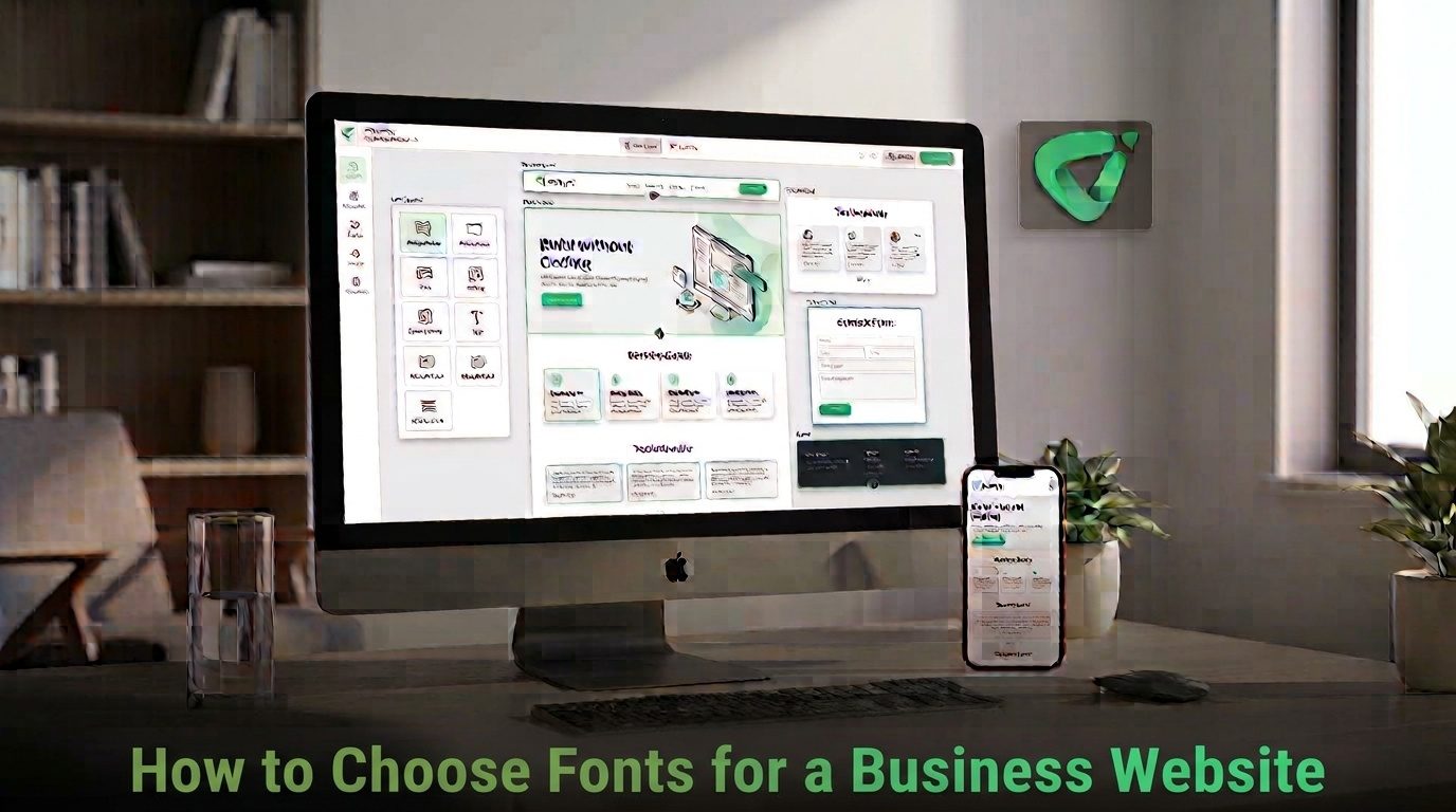
Choosing fonts for a business website is not just a branding decision. The typefaces you use affect how easily visitors can read your content, how professional the site feels, and how consistently your brand comes across across pages and devices.The good news is that you do not need dozens of fonts to create a strong website. In most cases, a small, deliberate typography system works better. Here is how to choose website fonts that balance brand personality, readability, accessibility, and performance.
Start With the Personality of Your Business
Before browsing font libraries, define the impression your website should create. A law firm, creative studio, technology company, restaurant, and children's brand may all need different visual voices.
Think about three or four adjectives that describe the business. For example:
- Professional and established: Consider restrained serif or sans-serif typefaces with conventional letterforms.
- Modern and technical: A clean sans-serif can create a precise, contemporary appearance.
- Creative and expressive: A distinctive display font can work well for headings when paired with a simpler body font.
- Friendly and approachable: Rounded or softer typefaces may reinforce a more informal personality.
The goal is not to make the font literally represent the industry. It should support the brand's personality without getting in the way of the information visitors came to find.
Prioritize Readability for Body Text
Your headline can be distinctive, but most of the words on a business website are usually body copy: service descriptions, product information, FAQs, blog posts, forms, and navigation labels. That makes body-text readability one of the most important font-selection criteria.
Test potential fonts at the size visitors will actually see. Look closely at lowercase letters, punctuation, numbers, spacing, and similar characters such as “I,” “l,” and “1.” A font that looks excellent in a large design mockup may become tiring when used for several paragraphs.
Also check the font on a phone. A typeface that feels comfortable on a large desktop screen may have tighter spacing or less distinctive letterforms when displayed at smaller sizes.
Choose One Primary Font, Then Add a Supporting Font if Needed
A common mistake is treating font selection like a collection exercise. Using four, five, or six typefaces can make a business website feel inconsistent even when each individual font looks good.
A simpler approach is to establish a clear hierarchy:
| Website element |
Typical typography role |
What to prioritize |
| Headings |
Brand expression and hierarchy |
Distinctive but easy-to-read letterforms |
| Body text |
Information and explanation |
High readability and comfortable spacing |
| Navigation |
Wayfinding |
Clarity at smaller sizes |
| Buttons |
Calls to action |
Strong legibility and clear hierarchy |
You can use one font family throughout and create hierarchy through weight and size. Alternatively, use one family for headings and another for body text. If you choose two families, make sure they have enough contrast to feel intentional without competing for attention.
Check Font Weight, Spacing, and Line Height
Choosing the family is only the beginning. Typography can feel completely different depending on weight, size, letter spacing, and line height.
Use weight to establish hierarchy
Reserve heavier weights for headings and important interface elements rather than making everything bold. Body copy generally benefits from a regular or medium weight that remains comfortable across longer passages.
Give paragraphs enough breathing room
Tightly packed lines make reading harder, especially on mobile screens. Adjust line height and paragraph spacing so individual lines and sections are easy to follow.
Do not rely on font size alone
A larger font is not automatically easier to read. Letterform design, weight, contrast, line length, and spacing all influence the final result. Test the complete combination rather than judging a font from its specimen page.
Make Accessibility Part of Font Selection
Typography should work for as many visitors as possible. The Web Content Accessibility Guidelines (WCAG) 2.2 specify, among other requirements, minimum contrast ratios for text. For normal text, WCAG 2.2 Level AA calls for a contrast ratio of at least 4.5:1; large text has a 3:1 minimum. W W3C+1
W3C+1
Font choice and color choice therefore need to be considered together. Very thin or unusual letterforms can also be harder to read, particularly at lower contrast levels. WW3C
When reviewing a font, ask:
- Are the letters easy to distinguish at normal body-text sizes?
- Does the chosen weight remain clear against the background?
- Can headings and links be identified without relying only on color?
- Does the typography remain usable when text is enlarged?
Accessibility is not something to check after the design is finished. It should influence the typeface, weight, color, and spacing decisions from the beginning.
Consider Web Font Performance
A beautiful font is not useful if it creates unnecessary loading problems. Web fonts are additional resources that browsers need to download and render, and their loading behavior can affect how quickly text appears and whether content shifts while the page loads. G Google for Developers+1
Keep the typography system efficient. Avoid loading large numbers of font families and unnecessary weights. If you only need regular and bold, there is usually little reason to load every available variation.
Modern web-font techniques can also control how browsers display text while custom fonts are loading. For example, the font-display property can be used to define fallback behavior, while careful font delivery can reduce rendering delays and layout shifts. W web.dev+1
If you use a service such as Google Fonts, choose the families and weights you actually need rather than treating the entire library as available by default. Google's developer documentation also describes techniques for limiting font requests to the characters and styles a page requires. GGoogle for Developers
Test Your Fonts Before You Commit
Do not make the final decision from a font website alone. Put your shortlisted choices into a realistic page and test the complete system.
- Write a sample headline that resembles your actual homepage heading.
- Add a few paragraphs using real or representative business copy.
- Test navigation and buttons at their expected sizes.
- View the page on mobile as well as desktop.
- Check contrast and readability before publishing.
- Review loading behavior if you are using custom web fonts.
It is also useful to leave the design for a short time and review it again. Fonts that initially feel exciting can become distracting when you see them repeated throughout an entire site.
Keep Your Typography Consistent Across the Website
Once you have selected your fonts, document the basic rules. Decide which family and weight are used for headings, body copy, navigation, buttons, captions, and other recurring elements.
Consistency matters because visitors should not have to relearn the visual hierarchy on every page. A clear typography system also makes future updates easier because new pages can follow established rules rather than introducing another font each time.
If you are starting a business website from scratch, Volnyn's AI website builder can generate a complete site from a description and lets you customize text, images, colors, and sections through its visual editor. Volnyn also provides templates for different business types and responsive websites designed for desktop and mobile screens. V Volnyn
Common Font-Selection Mistakes to Avoid
- Choosing a font because it looks trendy: Trends change, but your website needs to remain usable and recognizable.
- Using too many typefaces: Multiple fonts can quickly weaken visual consistency.
- Ignoring mobile: Always test typography at smaller screen sizes.
- Using very light body text: Thin weights can reduce legibility, particularly against light backgrounds.
- Loading every available font weight: Only include the styles your design actually uses.
- Skipping contrast checks: Attractive color combinations are not necessarily accessible ones.
Conclusion
The best fonts for a business website are not necessarily the most distinctive or fashionable. They are the ones that support your brand while making your content easy to read and your interface easy to navigate.
Start with your brand personality, prioritize body-text readability, create a simple hierarchy, check accessibility, and keep font loading efficient. Then test the complete typography system on real pages and real devices before publishing.
Good typography should be noticeable enough to make the website feel intentional, but restrained enough that visitors can focus on the business rather than the font itself.