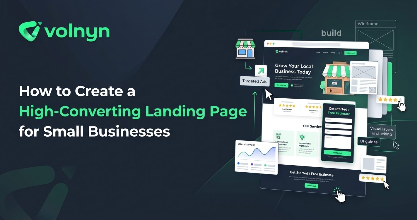
A small business landing page has one job: help the right visitor take the next step. That might mean requesting a quote, booking an appointment, signing up for a service, downloading a guide, or making a purchase.
The challenge is that many landing pages try to do too much. They introduce the entire business, list every service, add multiple calls to action, and bury the main offer beneath unnecessary information. A high-converting landing page takes a different approach: it gives one audience a clear reason to act and makes that action easy.
Here is how to create a landing page that gives small-business visitors a clearer path from interest to conversion.
1. Start With One Conversion Goal
Before choosing colors, images, or layouts, decide what the page should accomplish. A landing page becomes harder to understand when it asks visitors to perform several unrelated actions.
For a small business, the primary goal might be:
- Requesting a quote
- Booking an appointment
- Scheduling a consultation
- Requesting a product demonstration
- Signing up for an offer
- Making a purchase
Choose one primary action and build the page around it. Secondary information can still exist, but it should support the main conversion rather than compete with it.
2. Define the Audience and Offer
A landing page becomes more persuasive when visitors immediately recognize that it is relevant to them. Instead of writing broad statements about your company, identify the specific customer and problem the page addresses.
For example, a landscaping company could create a page specifically for homeowners looking for seasonal garden maintenance. A marketing consultant could build a page for local businesses that need help generating enquiries.
Then connect that audience to a clear offer. The visitor should quickly understand what you provide, who it is for, and what they can do next.
3. Write a Headline That Communicates the Benefit
Your headline is often the first piece of copy a visitor reads. Avoid using vague claims such as “Welcome to Our Business” or “Quality Services You Can Trust.” These statements may sound professional, but they do not explain why the visitor should continue.
A stronger headline communicates the customer outcome or specific offer.
For example, instead of “Professional Accounting Services,” a small business might use “Simplify Your Business Taxes With a Dedicated Local Accountant.”
The supporting subheading can then explain the service in more detail and introduce the next step.
4. Make the Call to Action Obvious
A visitor should never have to search the page to figure out what to do. Use a clear call-to-action button that describes the next step.
- Request a Free Quote
- Book an Appointment
- Schedule a Consultation
- Get Started Today
- Request a Demo
Use the same primary CTA throughout the page when repeated calls to action are useful. Consistency helps visitors understand that each button leads toward the same outcome.
For additional guidance on CTA placement, see Volnyn's guide to where a call-to-action button should go.
5. Show Why Visitors Should Trust the Business
Even a clear offer may not generate conversions if visitors are unsure whether the business can deliver. Trust signals provide evidence that supports the claims made on the page.
Depending on the business, useful trust elements can include:
- Customer testimonials
- Relevant case studies
- Reviews or ratings
- Industry credentials
- Years of relevant experience
- Client or partner logos that you are authorized to display
- Clear contact information
Keep the evidence specific and genuine. A short testimonial describing a real customer outcome is more useful than a collection of vague marketing statements.
6. Keep the Page Focused
A landing page does not need to contain everything about the business. Its content should answer the questions a visitor needs answered before taking the intended action.
A practical structure might look like this:
- Hero section: Present the headline, main benefit, and primary CTA.
- Problem and solution: Explain the customer problem and how the offer addresses it.
- Benefits: Show the practical reasons to choose the offer.
- Proof: Add testimonials, results, credentials, or other relevant evidence.
- Process: Explain what happens after the visitor converts.
- FAQ: Address genuine concerns that could prevent action.
- Final CTA: Give interested visitors a clear final opportunity to convert.
This structure can be adapted to almost any small-business offer. The important point is that every section should have a purpose.
7. Make the Form Easy to Complete
If your goal is lead generation, the form deserves as much attention as the page design. Ask for information you genuinely need to respond to or qualify the enquiry.
A basic service enquiry might only need a name, email address, phone number, and short description of the project. A more complex sales process may require additional details such as company size, budget, location, or preferred timeframe.
Avoid adding fields simply because the information might be useful someday. Every additional question can increase the amount of effort required from the visitor.
8. Design for Mobile Visitors
A landing page needs to work on smaller screens as well as desktops. Check the mobile version before sending visitors to it.
Pay particular attention to headline size, button placement, form usability, image cropping, spacing, and page length. Important information should not become difficult to find simply because the screen is narrower.
Google also recommends providing a good overall page experience, including mobile usability, secure delivery, and strong Core Web Vitals. G Google for Developers+1
9. Remove Friction Before You Launch
Conversion problems are not always caused by poor copy. Sometimes visitors simply encounter too much friction.
Before publishing, test the complete journey yourself:
- Open the page on a phone and desktop.
- Check that the headline and offer are immediately understandable.
- Click every important CTA.
- Submit the form using a test enquiry.
- Confirm that the submission reaches the correct destination.
- Check the confirmation message or next step.
- Make sure contact details and important links work.
A page that looks polished but has a broken form or unclear confirmation process will not perform as intended.
10. Improve the Page With Real Data
There is no universal headline, button color, form length, or page structure that guarantees a particular conversion rate. Your audience and offer determine what works.
After launch, look for evidence of where visitors struggle. If people leave without interacting, reconsider the offer and opening section. If visitors reach the form but rarely submit it, examine the amount of information requested and whether the value of completing it is clear.
Where traffic volume allows, test meaningful changes such as different headlines, offers, CTAs, page structures, or form requirements. Change one important variable at a time when practical so you can better understand what affected the result.
Create a Landing Page With Volnyn
If you want to build a landing page without starting from a blank canvas, Volnyn's AI Website Builder supports focused landing pages for campaigns, launches, and lead capture. Volnyn says its builder can generate a website structure and content from a description, then lets you customize the result with a visual drag-and-drop editor.
The platform also offers templates, mobile-responsive designs, hosting, and custom-domain support. V Volnyn
For a small business, the useful approach is to treat AI-generated content as a starting point. Replace generic copy with your actual offer, customer language, proof, images, contact process, and conversion goal before publishing.
Conclusion
A high-converting landing page does not need to be complicated. It needs to be relevant to the visitor and clear about the next step.
Start with one conversion goal, define a specific audience, communicate a strong benefit, use a clear CTA, provide credible trust signals, keep forms focused, and make the experience work well on mobile. Then use real visitor behavior to identify what should be improved.
For small businesses, that focused approach can turn a simple web page into a useful part of the customer acquisition process.