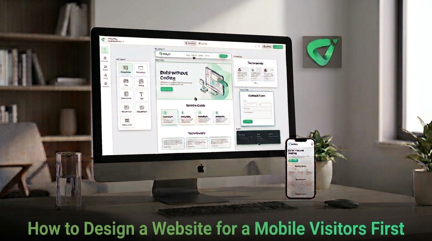
A website can look excellent on a desktop and still be frustrating on a phone. If mobile visitors have to pinch and zoom, hunt through a crowded menu, wait for oversized images, or struggle to tap a button, the design is working against them.A mobile-first website starts with the smaller screen and the constraints that come with it. You decide what matters most, make the essential actions easy to reach, and then expand the experience for tablets and desktops. This approach is especially relevant to search visibility because Google uses the mobile version of a site's content for indexing and ranking under mobile-first indexing. Google's mobile-first guidance also recommends responsive web design as a practical configuration for websites. G Google for Developers
Start With the Mobile Visitor's Goal
Before choosing fonts, colors, or animations, identify what visitors actually need to accomplish.
A restaurant visitor might want the menu, opening hours, location, or reservation option. A service business may need visitors to understand the service and request a quote. A portfolio might need to put selected work and contact information within easy reach.
On a smaller screen, unnecessary elements become more expensive. Every extra section competes for attention and pushes important information farther down the page.
Write down the site's primary goal and the two or three actions that support it. Then design the mobile experience around those priorities.
Build the Content Hierarchy Before the Layout
Mobile-first design is not simply “make everything smaller.” It requires deciding what should appear first.
A useful mobile page hierarchy often looks like this:
- Clear value proposition: Explain what the business, product, or service offers.
- Primary action: Give visitors an obvious next step.
- Essential information: Present the details needed to make a decision.
- Proof and supporting content: Add testimonials, examples, credentials, or useful explanations.
- Secondary information: Keep less urgent material available without allowing it to dominate the page.
This structure makes the page useful even when someone only scans the first few sections on a phone.
Keep Mobile Navigation Simple
Desktop navigation can accommodate more visible options because there is more horizontal space. A phone cannot.
Keep the primary navigation focused on the pages people genuinely need. Use familiar labels, avoid unnecessary layers, and make the menu easy to open and close.
Do not hide critical information simply because it is mobile. Your mobile experience should contain the same essential information and meaningful functionality as the desktop version. Google specifically recommends maintaining important content and metadata when designing for mobile-first indexing. GGoogle for Developers
Design Buttons and Forms for Touch
A mouse pointer is precise. A finger is not. That difference should influence how you design interactive elements.
Primary buttons should have enough space around them to prevent accidental taps. Forms should use clear labels and sensible input fields rather than forcing visitors to manipulate tiny controls.
W3C guidance on touch targets highlights the importance of sufficiently large interactive areas for people using touchscreens. WCAG 2.2 includes a minimum target-size criterion of 24 by 24 CSS pixels for applicable controls, while larger targets can make interactions easier in practice. W W3C
W3C
For important actions, ask a simple question: Could someone comfortably use this page with one hand? If the answer is no, look for opportunities to increase spacing, simplify the interaction, or reduce the number of steps.
Make Typography and Images Work on Small Screens
Readable content is one of the easiest ways to improve a mobile website.
Use a clear type hierarchy, comfortable line spacing, and paragraphs that do not become large walls of text. Avoid forcing visitors to zoom into product details, service information, or important instructions.
Images also need to earn their space. Large decorative images can push useful information below the fold and increase the amount of content that needs to load. Choose images that support the page's purpose, use appropriate dimensions, and make sure important subjects are not awkwardly cropped on narrow screens.
Responsive design should allow content to reflow naturally rather than creating horizontal scrolling. Google's mobile guidance recommends responsive design because the same URL and content can adapt to different screen sizes without maintaining separate mobile and desktop versions. GGoogle for Developers
Design for Speed, Not Just Appearance
A mobile visitor may be using a slower connection or a less powerful device than the computer used to design the site. A visually impressive page is not successful if the important content takes too long to become usable.
Pay attention to image sizes, unnecessary scripts, heavy animations, and layout elements that shift while the page loads. Google describes Core Web Vitals around three important aspects of experience: loading performance, responsiveness, and visual stability. Its current guidance identifies LCP, INP, and CLS as the Core Web Vitals metrics. GGoogle for Developers
That gives you a useful practical test: does the important content appear quickly, does the page respond promptly when someone interacts with it, and does the layout stay stable while it loads?
Test the Website on a Real Phone
A desktop browser resized to a narrow window is useful, but it should not be your only mobile test.
Open the actual website on a phone and complete the tasks a visitor is expected to complete. Try the navigation. Tap the main buttons. Fill out the contact form. Read a long section. Open images. Check the footer. If the site sells something, go through the purchase path as far as practical.
Use this quick mobile-first checklist before publishing:
- Can visitors understand the site's purpose within a few seconds?
- Is the primary action easy to find and tap?
- Can visitors navigate without accidental taps?
- Is the text comfortable to read without zooming?
- Do images resize and crop appropriately?
- Is there any unwanted horizontal scrolling?
- Do forms work comfortably on a touchscreen?
- Does the page remain stable while content loads?
- Are important desktop features also available on mobile?
Use a Mobile-First Workflow When Building
The process becomes easier when mobile considerations are made before the design becomes complicated.
- Define the visitor: Identify who is most likely to use the site and what they need.
- Choose the primary action: Decide what you want visitors to do next.
- Reduce the content: Remove sections that do not support the visitor's goal.
- Design the mobile structure: Arrange the essential content for a narrow screen first.
- Expand for larger screens: Add columns, wider imagery, and additional spacing where they genuinely improve the experience.
- Test real tasks: Use the site on an actual phone and fix problems before launch.
If you are starting from scratch, Volnyn's AI Website Builder can generate a website from a natural-language description, with responsive layouts for phones, tablets, and desktops. You can then customize the generated structure and review the mobile version before publishing. V Volnyn
Common Mobile-First Design Mistakes
Several problems repeatedly appear when a desktop layout is treated as the starting point.
- Too much content above the primary action: Visitors have to scroll through decoration before finding what they came for.
- Desktop navigation squeezed onto mobile: Too many choices make menus difficult to use.
- Small interactive controls: Buttons, icons, or form elements are difficult to tap accurately.
- Oversized media: Large images dominate the screen without adding enough value.
- Desktop-only assumptions: Important information or functionality disappears on smaller screens.
- Testing only at the end: Mobile problems discovered after the entire desktop design is finished can require unnecessary rework.
Conclusion
Designing for mobile visitors first is fundamentally an exercise in prioritization. Start with the visitor's goal, organize the most important information first, make interactions comfortable, keep pages efficient, and test the experience on a real phone.
The desktop version can then grow from that foundation rather than forcing a small screen to accommodate a design created for a much larger one.
Whether you are creating a business site, portfolio, store, or landing page, a mobile-first process gives you a practical way to decide what belongs on the page and how visitors should move through it. If you want an AI-assisted starting point, Volnyn's AI Website Builder can turn a description into a customizable website, after which you can refine the content, structure, and mobile experience around your actual visitors. VVolnyn